Back to Part 2 : - A leaflet that people will pick up
You can lead a horse to water but you can't make it drink.
In Part 1 and part 2 of this series I show how I tried to make the leaflet visible enough to make people want to pick it up. But once they open it up, will they read it?
Part 3: How to write a leaflet that people will ...
Read
I took my Biodiversity - sorry, "Saving wildlife" leaflet - to the Lichens workshop at Horton and asked three ladies at Horton Mother's Union to have a look at the different versions.
Yes .. they were very positive and affirmative in saying the cover should say Saving wildlife rather than Biodiversity, and looked at the cover of the three sample leaflets with interest
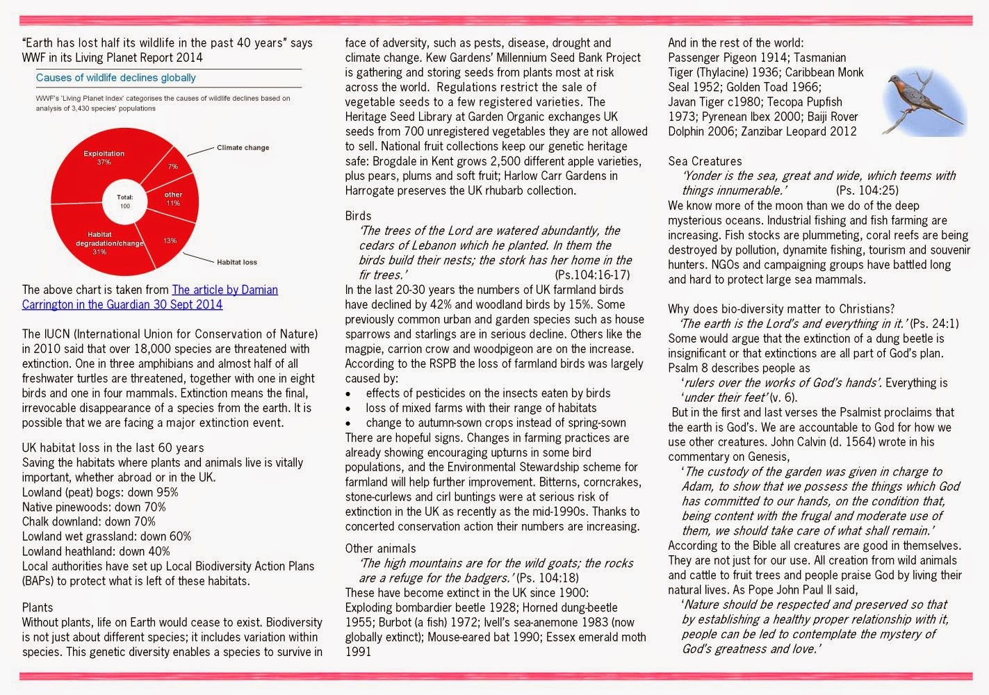
But when we opened them .... they looked blank.
Thoroughly blank
Silence.
Thoroughly blank
Silence.
One lady said "Oh, it's rather dense."
Huh! they didn't even try to read it!!
No point in arguing.
That's why I had asked them to look at the leaflets. Back to the drawing board.
I had tried to cram material that I had moved from the front cover into the rest of the leaflet, and, because I had wanted to keep the print as big as possible, I had left very little white space.
Back at the computer again.
I made the print smaller,
the margins slightly wider
and made space between paragraphs. That looked better
the margins slightly wider
and made space between paragraphs. That looked better
Then I relearned how to do "Styles" in Word.
I set all the titles to a new style (I called JUD) - and every time I tried a different version, all the titles got changed simultaneously. Brilliant. I made bullet points and changed them to little arrows/triangles.
How to make and edit a new style in Word 10
With the "Home" menu bar showing at the top,
1. Triple click on the title concerned (or use another way of your choice to highlight it)
Then, either
2. right click to get a list to show, and go down with the pointer to where it says styles , and then a selection of possible styles will appear
2. right click to get a list to show, and go down with the pointer to where it says styles , and then a selection of possible styles will appear
or
go to the section on the bar at the top and click on a style that you would like
3. Then right click so you will get a list.
4. Go down to "Modify" and left click on that
4. Go down to "Modify" and left click on that
5. Modify the style if you want to.
6. Save it.
So here are the before and after versions:
Before:

After:
6. Save it.
So here are the before and after versions:
Before:

After:
Quite a lot better don't you think?
I even added two questions with spaces to write the answers and a little pen to make it more enticing. Interact with the audience.
I took them to the Anglican Church Lunch at Settle today (21 Oct) . (They have good lunches on Tuesdays)
One lady liked the new version best,
..but the second went for the original version -"I haven't brought my glasses". she said, holding the leaflet at near arms length.
Hey ho.
What to do.
Certainly if I wanted to get children to read this - even just to test this out for me I feel I need bigger print.
Maybe print it on A3? - but then the triptych would not fit in a dispenser.
Or rearrange the text and print it on two sheets of A4 and stick them together...
I did not want to cut any more text out.
Suggestions welcome
Back to Part 1 (Intro).
Back to Part 2 : - A leaflet that people will PICK UP
Forward to Part 4: A leaflet that people will ACT ON

No comments:
Post a Comment